Responsive Web Design For Mobile Devices is needed because everyone nowadays is using mobile devices to surf the web and it’s growing at an astronomical pace.
So why is Responsive Web Design For Mobile Devices so important? Unfortunately, a lot of websites are not optimized for mobile devices. Mobile devices often have different display sizes and require a unique approach to how content is laid out on the mobile or tablet screen.

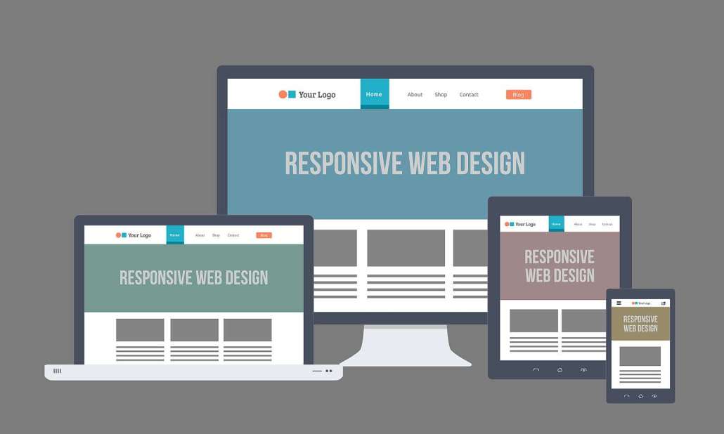
There is a multitude of different screen sizes across phones, tablets, desktops, game consoles, TVs, etc. Mobile screen sizes are constantly changing, so it’s important that your web site design can adapt to any screen size, today or in the future.
Bohol Web Design Builds Responsive Mobile-Friendly Websites!
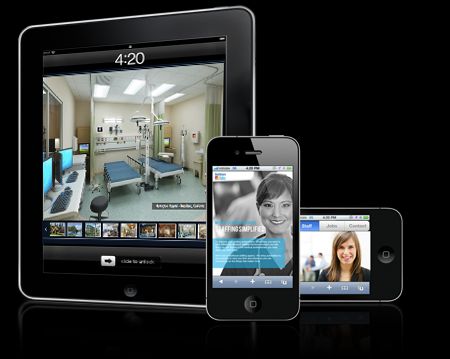
Our responsive web sites are designed to be accessible across all devices regardless of screen size.
From smartphones and tablets to laptops and desktops, put your site in the palm of everyone’s hand with responsive web design.
Responsive web design ensures your site is fully functional across various screen sizes and devices.
All sites designed and developed at Bohol Web Design are responsive and tested across the latest browsers and devices.
Make your site responsive and reach your visitors on all of their devices.
Bohol Web Design offers an extensive portfolio of responsive sites including but not limited to hotel and resort, eCommerce, directory sites, marketing websites, and so forth. We have over 20 years of experience in designing and developing responsive sites and can help you with the following:
- Redesign your site to provide a mobile-friendly experience
- Overhaul entire site to become responsive
Responsive sites are easy for visitors to navigate and easy for web administrators to update.
- When your site is responsive, you’ll update your site in one place and the content will be available on smartphones, tablets, and desktops.
- Because Google prefers to index a single site, your site rankings will benefit from having the same URLs and page content.
- Your visitors will have a consistent experience visiting your site across all of their devices and your authors will only have to publish a single version of the content.
We Use High-Performance Mobile Technology for Responsive Web Design For Mobile Devices
High-Performance Mobile Technology is critical for mobile designs. Website speed and size have a massive impact on bounce rates and conversion rates: over half of smartphone users expect websites to load in under four seconds.
That’s why we have created Responsive Web Design For Mobile Devices, fast and flexible websites that perform consistently across devices. Specializing in the latest HTML5 and CSS3 technologies, Bohol Web Design is well-versed in popular responsive frameworks like Bootstrap CSS3.
Click Here to Contact Us Today to get a mobile friendly website that works and looks great in any and all screen sizes.